
The Forgotten Text
An idea, a compilation, and an attempt at brevity

Hey folks👋
To the 1000+ new subscribers who’ve joined Tigerfeathers over the past month, you should know that this is the first time in five years we’ve published something for four weeks in a row. Welcome to ‘The Honeymoon Period’.
Share this post with a friend (or…lover?) to keep the romance alive for another week🌹
This edition of Tigerfeathers is presented by…Bombay Locale

“Nobody owes you attention. We help you grab some.”
Bombay Locale is a global creative studio that helps tech companies cut through the noise by turning complex ideas into compelling, cinematic stories. Their masthead says it all: "Storytelling that works."
Over the last 8 years, they've crafted explainer films, launch videos, brand campaigns, and investor content for companies like Zoho, Hubilo, Pingsafe, InVideo, Defy, ClearTax, Jio, and dozens of early-stage players across SaaS, fintech, crypto, and AI.
What sets them apart is their technical chops—they’re ‘techies turned storytellers’. They believe that behind every complex product is a human problem worth solving, and that emotional connection is where great storytelling comes alive.
The company originally started as a scrappy experiment between two brothers working out of hostel rooms and friends' apartments with borrowed gear. Today it’s evolved into a colourful team of designers, engineers, bankers, filmmakers, and all sorts of misfits united by a shared love of great stories.
If you’re building in consumer, fintech, SaaS, or AI, and you’ve got a story you want to bring to life, get in touch with them at hello@bombaylocale.com, or book a call with the Bombay Locale team here:
And if you're interested in sponsoring a future edition of Tigerfeathers, hit us up on Twitter/LinkedIn or by replying to this email. With that, let’s get to it.
At some point in the last two weeks we had a breakthrough that was so profound I can only imagine it’s what the first two cavemen felt when they discovered fire.
While firming up our publishing schedule for the next couple of months, it dawned on us that maybe not every single Tigerfeathers piece needs to be 40,000 words. Or 10,000 words. Or even 1,000 words. It’s a radical idea that most of you will wonder why we haven’t considered sooner *nervous laughter*.
Anyway, if you caught last week’s breezy story on how Bangalore became India’s tech capital, it’s the kind of piece you can expect to see more of over the next six months, in between our typically longer startup deep dives (of which the next edition will be published in late July 👀🐉). We’ve lined up a bunch of awesome interviews, historical vignettes, and half-baked-tech-musings that we’re excited to experiment with, not to mention the upcoming launch of The Tigerfeathers Spotlight Series which was first announced in our 2024 year-end review (more details at the bottom of this email too). The main goal is to keep things moving (and not to disappear) while working on the longer-term stuff.
Which brings us to this week. The title of today’s essay - The Forgotten Text - refers to two things. One, it’s the official description of an idea I first heard about from Sam Parr, founder of The Hustle, co-founder of Hampton, and co-host of My First Million. And two, it’s because it’s a repurposing of a couple of paragraphs that I straight up forgot to include in my final draft of our story on Hunger Inc from a few weeks ago. I considered just updating that piece post-hoc but concluded that the idea is fun enough to merit its own short post - and will probably be useful to you regardless of whether you’re in the business of making things for consumers or enterprises. We use it all the time, even in this email.
Ok so what is The Forgotten Text?
Sam Parr founded the business newsletter - The Hustle - in 2016, and sold it for a reported $27 million to enterprise giant HubSpot in 2020. In many ways The Hustle pioneered a lot of the modern playbook for B2B and enterprise content, and perfectly exemplified how an established software company could naturally benefit from partnering with a niche media business with an engaged audience 👀.
On a podcast talking about why they were so good at grabbing people’s attention, Sam talked about how their welcome emails set the tone for the brand they wanted to build, and the experience they wanted their readers to have:
There's this part that I call ‘The Forgotten Text’. So when you sign up to a newsletter, the ‘thank you’ page after you sign up typically - because you installed some software - says ‘thanks, check your email’. So I’m like we gotta make that special. But then it was the welcome email. Nine out of ten times, at least before we started, it was just like some generic ‘thanks for subscribing, click here to confirm’. Instead I was like no, that's Forgotten Text, we’ve gotta use that.
And so I wrote this really good in-depth email where I was like ‘What just happened was magic. You see, as you entered your email, a little bell went off in our office, and when we heard that bell, we went crazy. I just saw my head of operations Kara, she just ran outside and hugged a guy, and another employee John is now doing 15 push-ups because he's so excited he had to work off some energy. And then this other person is going to do this other thing - wait I gotta go stop them, they're going to get in trouble. But hey, before I leave I just want to say I really appreciate you for signing up. You're going to get your first email tomorrow and it means a lot to me that you're here.’
I would do things like that. And at the time our brand was a little bro-y so we could get away with being a little obnoxious. But the whole trick was the Forgotten Text. It always has to be good.
The Forgotten Text - essentially the clever use of cleverer copywriting in places that are typically ignored by the average brand or company. Not just great copywriting, but great copywriting where you don’t expect great copywriting. Think welcome emails, uniforms, product packaging, push notifications, instruction manuals, guest bathrooms etc. Special brands will recognise these sub-prime pieces of real estate as an opportunity, and use them as instruments of leverage.
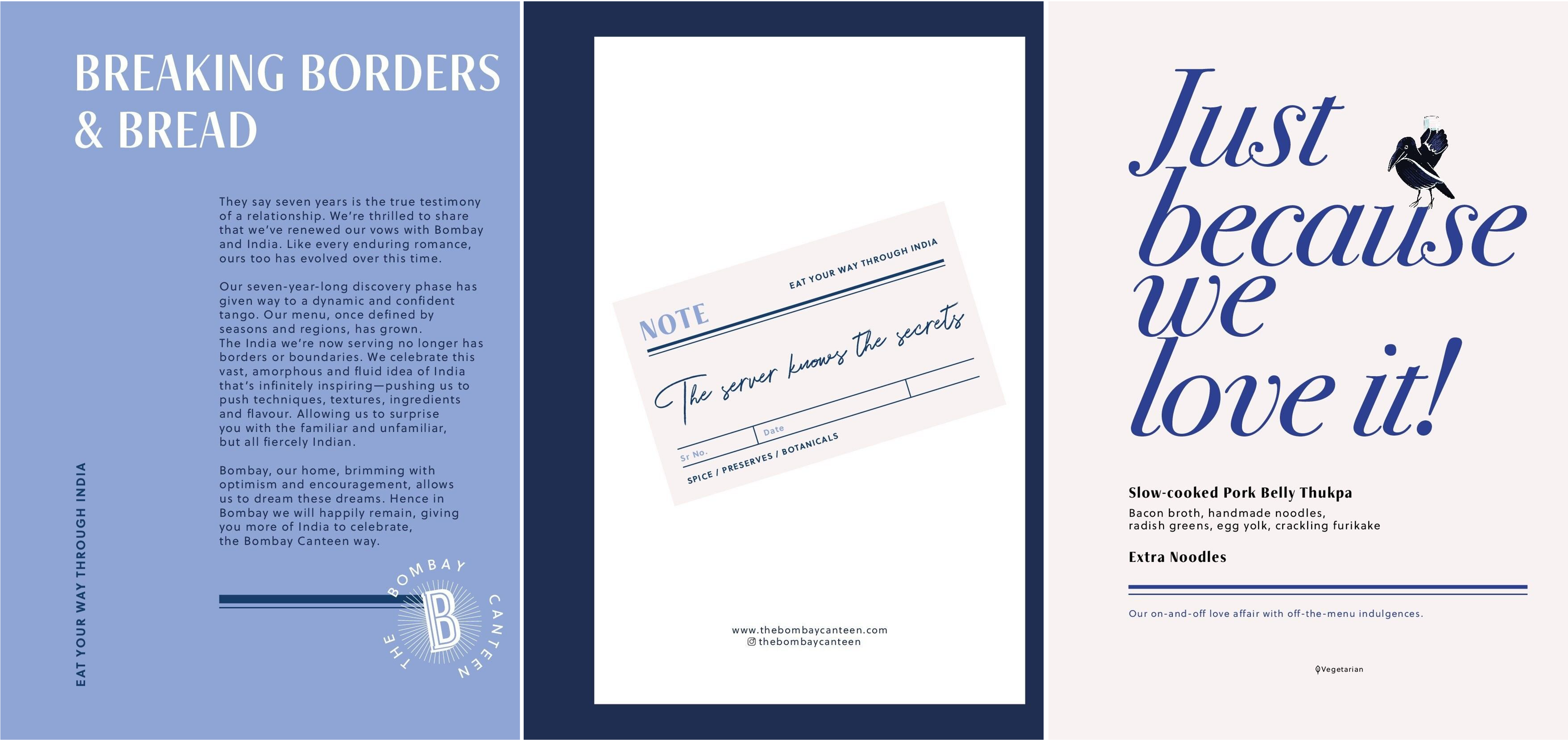
Case in point, when I was working on my story about Hunger Inc - Mumbai’s trailblazing restaurant and hospitality company - I wanted to document how intentional they were about injecting soul into every touchpoint at their restaurants. It’s one of their calling cards, to create restaurants that have a strong sense of identity, so you always know what they stand for when you’re dining with them. If you flick through the menu at The Bombay Canteen, for example, you will see far more than just the names of dishes and drinks.
Sticking with the hospitality theme - when my wife and I were in Sri Lanka earlier this year, we found a bar in Galle called Ropewalk that similarly nailed the copywriting in their menu. Evidently this instance was memorable enough that I thought of it while working on the draft of this piece six months later - with one bit of nomenclature in particular standing out:

Not only was the title memorable, but we liked the name so much we actually ordered it…confirming for ourselves why only Nabeel likes this.
Anyway, we’re suckers for good copywriting in these parts, particularly the Forgotten kind. So this past week we asked the Tigerfeathers community (AKA The Tigerbrethren AKA Friends of the Feather) on Twitter and LinkedIn to send over examples of Forgotten Text from Indian brands that do this best. Here’s an assortment of the best responses, some of which have come directly from the protagonists behind our favourite companies. Starting with…
The Croffle Guys
If you live in Mumbai (or if you’re an Indian millennial or Gen-Z with an Instagram account), there’s basically a 0% chance you haven’t seen The Croffle Guys muscle their way into your newsfeed over the past month. Amay Thakkar, Veer Pinto, Rahul Vohra and Annanya Agarwal are currently at the helm of the city’s most hyped food brand, attempting to create a new category of QSR around the lovechild of a croissant and a waffle - i.e. The Croffle. A major reason for the heartwarming early response from customers has been the design-flourishes they’ve incorporated - everywhere from their T-shirts to their Instagram stories to their plates and decor - which tell the story of a brand that wants to be “sexy, mischievous and relatable”.
“We see every inch of packaging as a blank canvas, like an invitation to infuse our personality,” says Annanya. “For us, the messaging is never just to tell you what’s inside, it’s about starting a conversation, cracking a smile, or sparking a craving before you even take a bite. Every bit of text is intended to be interactive, just like the experience at our store - a little playful, cheeky, and always welcoming.”

The Whole Truth
If 60% of the human body is made up of water, then 50% of the other 40% of my body is made up of The Whole Truth. Protein powder, peanut butter, muesli, protein bars, chocolate bars, whiskey bars (jk) - those mfs are just too good at what they do.
TWT’s original mission was/is to build ‘India’s first 100% clean-label food brand’ as an antidote to other food products that outright lie to their customers, or worse - those that tell half-truths. To that end, aside from making genuinely great tasting products, they don’t pinch pennies when it comes to design. Three years ago they brought in the big guns at Thought Over Design, one of India’s most formidable and in-demand design agencies, who’ve helped them craft a distinctive identity, one that includes their signature packaging (punctuated by ‘Truth Statements’) and copywriting (defined by a ‘good kind of vandalism’).

Maybe a better example for this piece in particular - this is what you see when you open a chocolate bar from The Whole Truth.
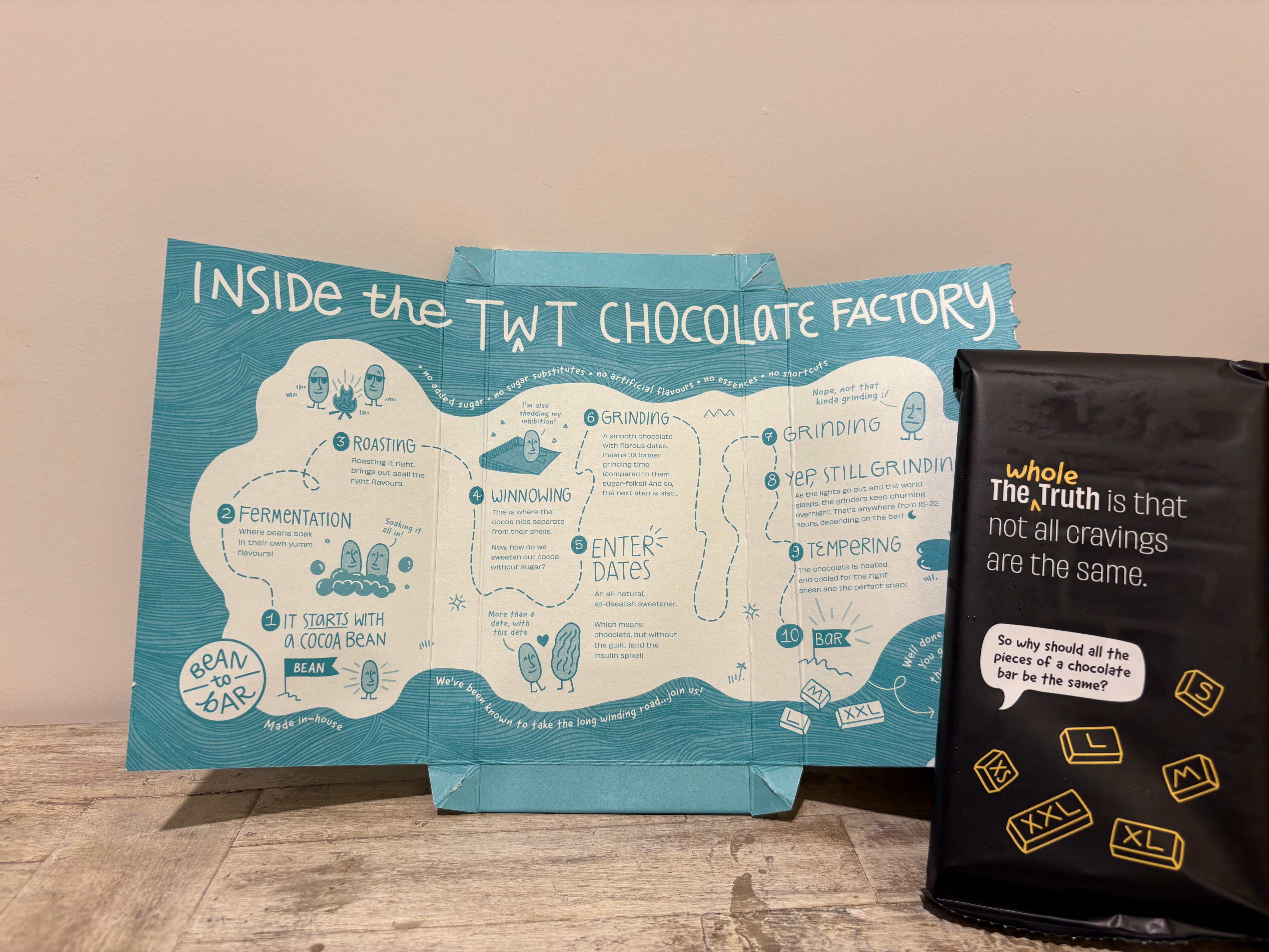
They don’t let a single pixel or fold go to waste, maximising what Ravishankar Iyer from The Story Rules Podcast calls “storytelling per square inch”.

Even the ice pack they use in their delivery packages has been thoughtfully considered.

I could go on and on (adding more examples to this section later on). To dispel any notions of bias here, not only am I not an investor in The Whole Truth, but I don’t think I know a single person who works at the company either. I’m just a fan of what they do. That being said if anyone from TWT is reading and wants to send us a carton of protein bars, we wouldn’t say no.
Nino Burgers
Nishant Jhaveri, co-founder of Mumbai-based burger chain Nino Burgers, told me about the rationale they used when designing their packaging before the launch of the brand in 2020.
“We wanted our vibe to be somewhere between Shake Shack and Headspace,” he says. “Everyone else’s delivery bags were brown. We wanted ours to say more, not just about Nino, but about the people ordering Nino as well. When you’re a delivery-first brand, aside from your food, your packaging is the other major way a customer experiences your brand. So it’s worth investing a little more to have a brand that stands out. Lots of people told us that blue and white weren’t good ‘food colours’ so we should avoid them in our packaging. I remember one person even told us not to use white because our bag looked like a chemist bag. We’re glad we didn’t listen to that guy.”

CRED
The fact that CRED has garnered the kind of national awareness and appreciation as an app that was originally focused on just helping you make your credit card payments, speaks to their incredible command over both medium and message. They take design very seriously. The company is hyper-fixated on making “beautiful” experiences that are furthest from boring, and their copywriting falls squarely within this mandate.
For instance, you know how when you’re in the app store trying to update some app, basically every single company will write some variation of ‘bug fixes and performance improvements’ to tell you what’s changed? This is CRED’s version:

Or take this screenshot from the FAQ section on their website:

Or even the names of the items on the CRED Store:

And even a bit of cheeky self-deprecation in their hiring announcements

CRED - not everyone gets it🤷♂️
Knya

Knya is one of the most interesting companies I’ve recently come across (and likely will be the subject of a longer Tigerfeathers essay at some point down the line). They’re trying to create the ‘Nike for doctors’ - a high-quality apparel brand built around championing medical professionals (instead of athletes). They offer premium scrubs, lab coats, and now even stethoscopes to hundreds of thousands of doctors (and many of the leading hospitals) across the country. They’ve also built a thriving community around the brand that is regularly fed by in-house content (via a podcast, Youtube channel, Instagram page etc), crafted to both educate and entertain medical professionals.
Abhijeet Kaji, one of Knya’s co-founders alongside his wife Vanshika, told me about one of their most endearing initiatives. “When we were speaking to our community of resident doctors and nurses, we realised that a simple pen carried a lot of emotional attachment for medical professionals. For them it’s never ‘just’ a pen - it’s their everyday companion. It’s what they use to record diagnoses, jot down instructions, remember something important when they’re running on 3 hours of sleep and a 1000 patient updates. But we learnt that most doctors will lose 10 pens over a 24 hour period. They’ll leave it behind in wards, lend it to one of their colleagues etc. And they’ll never say ‘no’ if someone asks to borrow a pen, because they know what it’s like to be on the other side. So we started thinking that, if Knya is really here to support the needs of medical professionals - big or small - is there something we could do around this?”
The answer was to design and produce a line of Knya pens, that they now give away with every purchase above a certain order value. It’s the kind of initiative that wouldn’t even cross your mind unless you were 100% committed to understanding the needs and routines of your community. The copywriting on the pen and the package makes the intent clear - “We want our customers to know that we get it”

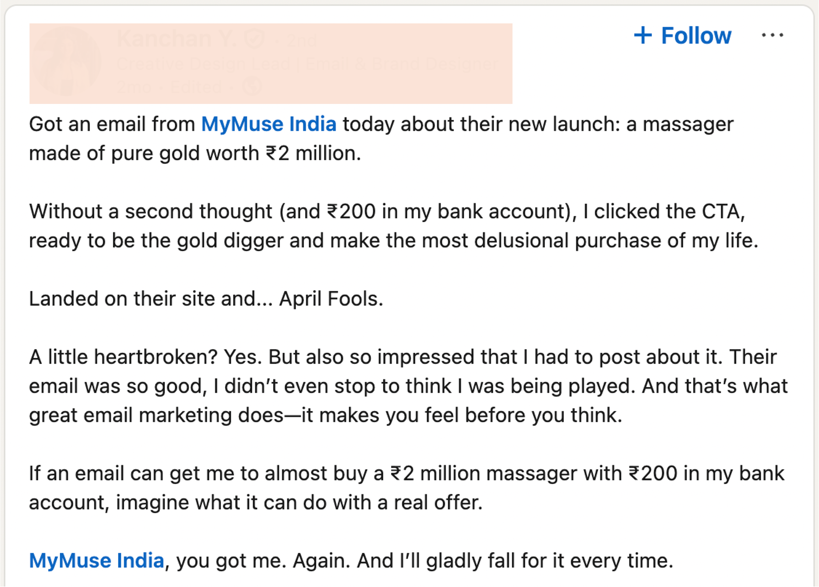
MyMuse
Another husband and wife duo - Sahil and Anushka Gupta - co-founders of MyMuse, are at the vanguard of a new wave of sexual wellness brands in the country. Given that they are trying to ‘Orchestrate The Bedroom Revolution’ in India, playfulness, personality and thoughtfulness sits at the centre of their design sensibilities.

They sent over a graphic of their April Fools email from earlier this year that caused the best kind of uproar from their almost 500K strong mailing list. It talked about the launch of a fabled golden massager.

They also sent over a screenshot documenting one of the many happy (/unhappy) reactions from their community.
Plum
And finally, our friends at Plum are building India’s leading employee benefits and business insurance company. That might not necessarily scream ‘edgy’ or ‘exciting’, but Plum do things differently.
Ganapathi Ramanathan, who handles content and brand marketing at Plum, explained that “We're in B2B and insurance, two industries that come with a rep of being boring. What's the point of yet another whitepaper or podcast or blog or resource kit if we're not having fun with it? We operate by the ‘logo swap’ principle - If we swapped the logos of our work with any other company's logo and we can't tell the difference, we don't ship it.”
While their black-and-white goal is insure millions of worker lives across India, their not-so-secret secret objective is to be seen as ‘the most trusted and loved insurance and benefits provider in the world’. Translation - they do a lot of content-y things that would be considered weird AF for any other insurance company.
For instance, instead of sending out dull brochures with policy information, they launched Cards Against Work - a riff on Cards Against Humanity - as a way to get their brand in office workers’ hands (apparently very popular during lunchbreaks, offsites, and Friday evening).

They also turned their own internal people management resource kit (email templates, benefit structures, best practices etc) into a public resource for any HR or People leaders that want to use it. And then they decided to label this docket in haiku form.

Among their various initiatives, my favourite might be ‘ESOP’s Fables – where office hours meet bedtime stories’, a collection of children’s stories inspired by the modern workplace, among several “odd” content products aimed at raising money for a good cause.
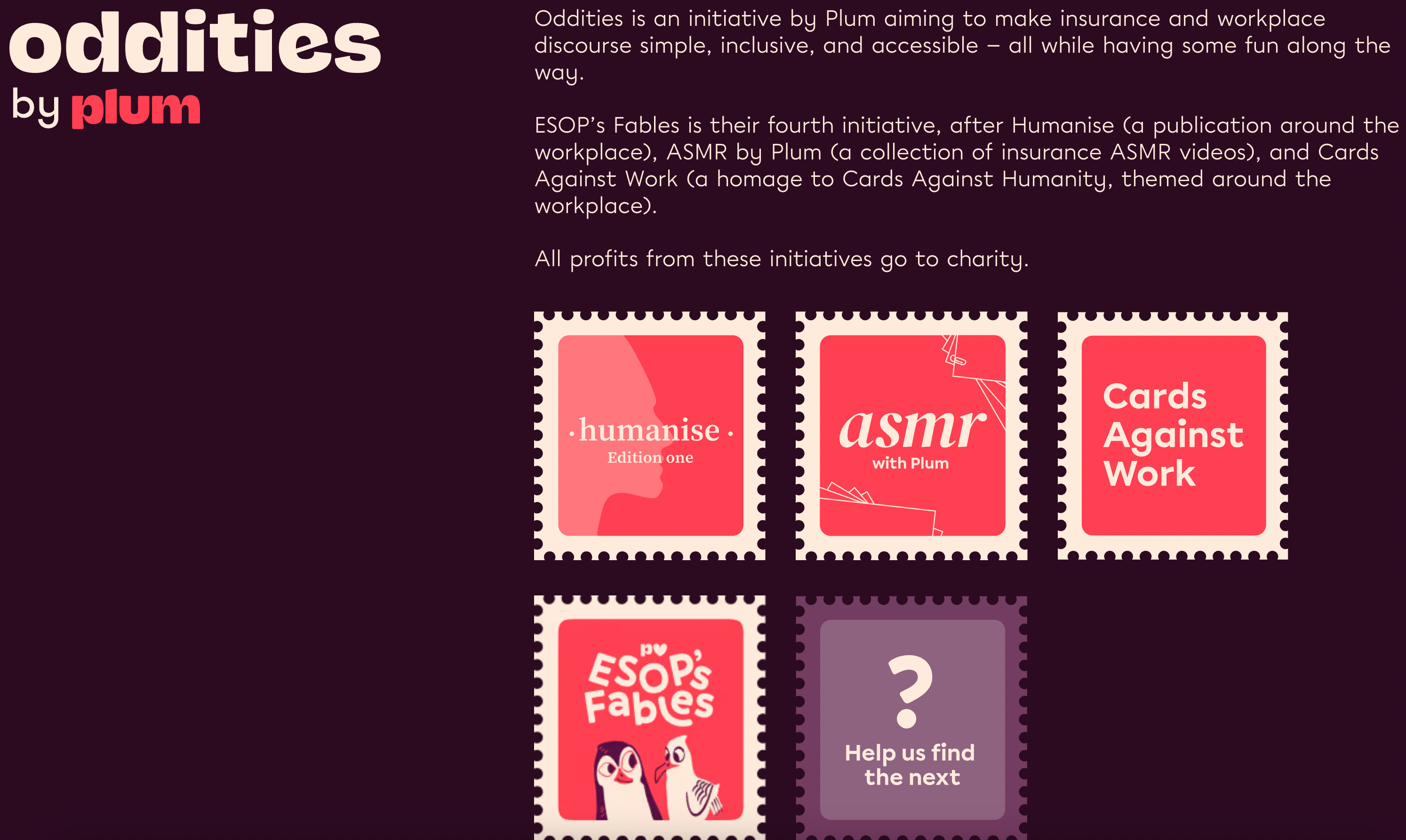
Ganapathi says “Delight is a guiding principle across our content and brand efforts. We don't have a singular brand voice, it's more a collective of fun people with their individualistic style, which is why our comms might sound different in different places. The goal is always to a) delight the reader, and b) showcase the talent of our writers. We make it a point to put a little bit of ourselves into the work we do, because what's the fun in it otherwise?”
And that’s it. That wasn’t so hard. 3000-ish words (but who’s counting?). Nothing fancy. No epic conclusion. If you’re leaving here with a single takeaway it would probably be something pithy like ‘Remember the Forgotten Text’ (or whatever).
If we’ve missed a brand or an example that you think belongs on this list, let us know and we’ll add it to the piece.
If not, enjoy your weekends, and we’ll see you (potentially) next week✌️
ACKNOWLEDGEMENTS
Thank you to everyone who sent in a suggestion or an image this week, including Annanya Agarwal, Abhijeet Kaji, Nishant Jhaveri, Sahil Gupta, Harnidh Kaur, Prashant Singh, Vijay Dhingra, Gautam Marwah and Ganapathi Ramanathan.
If you made it all the way here and you thought this was a good use of your time, it would mean a lot to us if you took a couple of seconds to share this post.
If you’re *still* here, dear reader, you may as well know that we’re going to be formally kicking off the Tigerfeathers Spotlight Series over the coming weeks. For the uninitiated, this is our programme to feature the sharpest guest writers (and guest writing) from India. We are looking for stories that are smartly written, rich with insights, and designed to illuminate some aspect of Indian tech, business, history or culture that our readers would find especially interesting, entertaining, or surprising (bonus points for hitting all three). Learn more about the programme in our 2024 year-end piece, and fill in this form if you’re keen to get involved. If you’ve already filled this in and haven’t gotten a response yet, don’t worry. We’ve been through your application and you can expect an email from us this week at the latest.
